https://www.dguilty.com/the-ultimate-guide-to-crafting-hyper-realistic-kit-miniature-houses/
a kit miniature house often lies not only in its exquisite craftsmanship but also in the feeling of being “drawn into it.” Looking at it, one can almost guess the owner’s personality, the atmosphere of the season, and even the temperature of the air. And this atmosphere is primarily determined by color, not furniture or lighting.
1. Color is the “first impression” of a miniature space
When the human eye sees a space, the first thing it recognizes is color.
While a real-world room can compensate for its lack of color through lighting, textures, and scents, a kit miniature house can’t. It’s static, frozen in time—so the first impression of color is crucial.
Try closing your eyes and imagining a “kitchen on a winter morning” or a “loft on a summer night.” The first thing that comes to mind isn’t the furniture’s shape, but the color palette: cool white, beige gray, warm yellow, deep blue. Miniature design evokes emotional memories through the warmth of color.
2. Psychological implications of warm and cool colors
In the miniature world, color is not just aesthetically pleasing but also a psychological narrative.
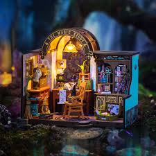
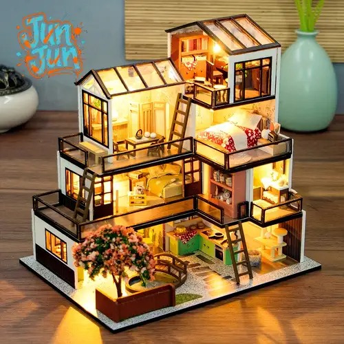
Warm tones (yellow, beige, and orange) tend to evoke feelings of comfort and security, and are often used in homes and fairytale-themed cottages. Cool tones (blue, gray, and green) evoke a sense of tranquility and distance, ideal for depicting nighttime, solitude, and contemplation.
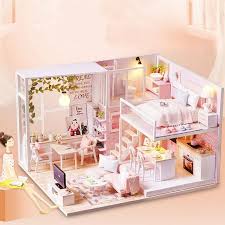
If you want the cabin to look cozy, you can use warm white as the main color, embellished with wood and soft yellow light.
If you want to create a dreamy or lonely feeling, you can use low-saturation cool colors, add a small amount of silver or glass reflections to make the air seem “cool”.
A true master does not simply choose warm or cold, but uses both to create a “temperature difference” – giving the space layers and stories.
3. The core of unified color matching: white space and transition
Many new miniature designers like to add a little bit of everything: pink walls, blue curtains, red carpet. This results in a noisy, collage-like space. The limited space of
a kit miniature house means every color is exaggerated.
Therefore, the key principle for color matching is: 60% primary color, 30% secondary color, and 10% accent color .
For example, in a living room with a 1:12 ratio, you can use light gray as the main color (occupying the floor and walls), dark brown wood furniture as the secondary color, and some green plants or copper lighting as embellishments. This ratio can focus the vision and allow the space to “breathe.”

4. The interactive relationship between material and color
The same color can create completely different impressions on different materials.
For example, white appears soft on fabric, cold and hard on metal, and warm and smooth on wood.
Therefore, when designing miniatures, don’t rush to mix the paint; first determine the material.
Wooden surfaces are suitable for aging treatment to make the colors appear natural;
fabrics can create shadows through layering or pleating to make the monochrome look less flat;
metal and glass can use reflection to increase the brightness of the space without being abrupt.
kit miniature houses , with the same white walls, make people feel warm while others appear cold – the difference lies in the collaboration between materials and light.
5. Colors Can Also Tell Time
In real life, colors change over time. Morning light makes walls appear golden, while evening light warms furniture. While
the kit miniature house is static, its color scheme suggests the passage of time.
For example, in the “Morning Theme”, cool light blue and soft white are used to make people feel that the sun has just come in;
in the “Night Theme”, warm yellow and dark brown can be used with a small amount of shadow to create a feeling of being wrapped in light.
These are not optical illusions, but resonances of memory. When viewers see these color combinations, they automatically complete the story in their minds.
6. Make color part of the narrative
Truly moving miniature artworks rely not on showmanship but on emotional consistency.
If your little house tells the story of a solitary painter, a touch of wet blue-gray paint is more powerful than any other decoration;
if it’s a festive dining table, a few red candles can bring the entire space to life.
The mission of color isn’t to please the eye, but to serve the story.
When viewers look at your miniature house kit and sense the flow of time, seasons, and emotions—that means you’ve “directed” it with color.
https://www.dguilty.com/the-ultimate-guide-to-crafting-hyper-realistic-kit-miniature-houses/