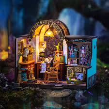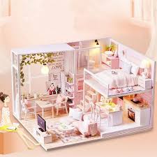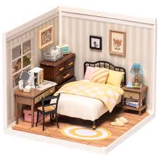
https://www.dguilty.com/the-ultimate-guide-to-crafting-hyper-realistic-kit-miniature-houses/
If you’ve ever built a kit miniature house , you’ll undoubtedly understand the regret of being just a little off—the model may have perfect proportions and precise structure, but it always feels like it lacks a touch of life. The problem often lies not in the proportions, but in the “fakeness” of the materials. True miniature masters consistently pursue one key principle: how to make materials appear “alive . “
Wood: Let the texture breathe
Wood is almost the first material every kit miniature house creator comes into contact with, but it’s also the easiest to mess up.
Too new, too flat, too straight—these are all signs of “fake wood.”
In real old wood, the color is uneven, and the grain isn’t perfect. Time leaves scratches, dents, fading, and even a hint of grease.
Experienced creators don’t “grind” with sandpaper, but rather “feel” the wood. They gently scrape along the grain, applying layer after layer of diluted paint so that the color appears to seep in rather than be painted on. Those varying shades of color make the wood look like it’s breathing.
Distressed textures aren’t about mimicking dirtiness, but about recreating traces of use. Perhaps someone cut bread on the table, or a child scraped a corner with their fingers. Just imagine these “stories” and you’ll know where to add depth and where to leave blank space.
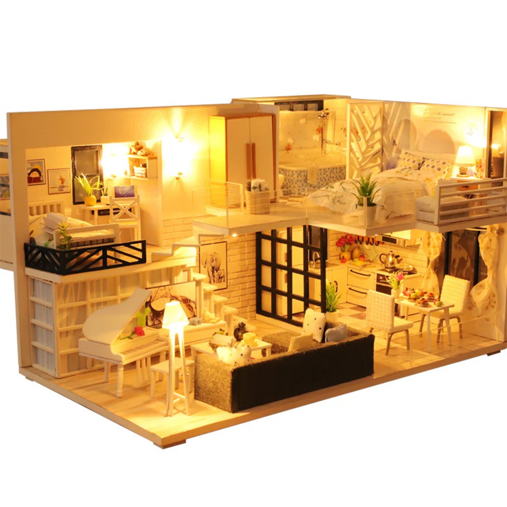
Paper: Light Material, Heavy Emotion
Paper is the magician of the miniature world. It can become a carpet, a curtain, a letter, a newspaper, or a lampshade. But it’s so light and fragile that the authenticity of proportion can be lost with a little carelessness.
The true sense of paper comes from “restraint.”
For example, when making curtains, they shouldn’t be the kind that hangs flat, but rather have a slight sense of droop—slight curling, folds, and shadows. That slight, natural bend makes people believe that “it really exists.”
The texture of paper can also convey emotion: rice paper brings a gentle light, kraft paper suggests the simplicity of a bygone era, and book pages carry a hint of storytelling. The paper you choose actually determines the temperament of this space.

Metal: Not Bright, But Cold
Metal is often misused. Many people prefer spraying silver or gold paint, but the result is always a plasticky feel.
Real metal has a warmth and a coolness. Its reflections aren’t harsh, but rather softly absorb light.
Experts often use a technique called “staining” on the metal surface. For example, lightly dabbing a dark gray pastel on the edge of a doorknob creates the illusion of repeated hand-touch. The subtle play of light and dark is enough to lend it authenticity.
Metal shouldn’t exist in isolation in Kit Miniature House . It should always be in contact with other things: the nails on the edge of the wooden table, the metal ring of the paper lampshade, the dull pots on the stove – it is the contrast of these materials that makes the space feel lively.
The miniature reality is not a copy, but a reconstruction
The ultimate purpose of all textures isn’t to mimic reality, but to convince the viewer that the world actually works .
You’re not creating a model, you’re creating a memory. The color difference of that piece of wood, the crease of that piece of paper, the reflection of that piece of metal, all speak in miniature. Together, they say, “Someone once lived here.”
a kit miniature house never relies on precise proportions, but rather on those imperfect details. Reality is often hidden in subtle deviations.
https://www.dguilty.com/the-ultimate-guide-to-crafting-hyper-realistic-kit-miniature-houses/